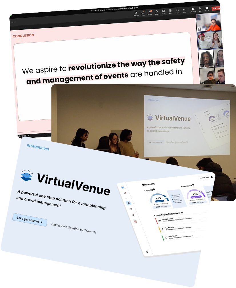
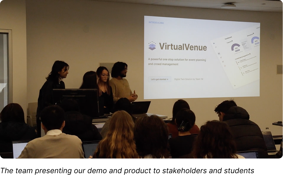
A Powerful One Stop Digital Twin Platform

Real-time tool that helps event planners manage crowds, respond to emergencies, and stay in control

VirtualVenue
A smarter way to run events.

Real-time venue visibility, crowd control, and infrastructure monitoring
all in
your hands.

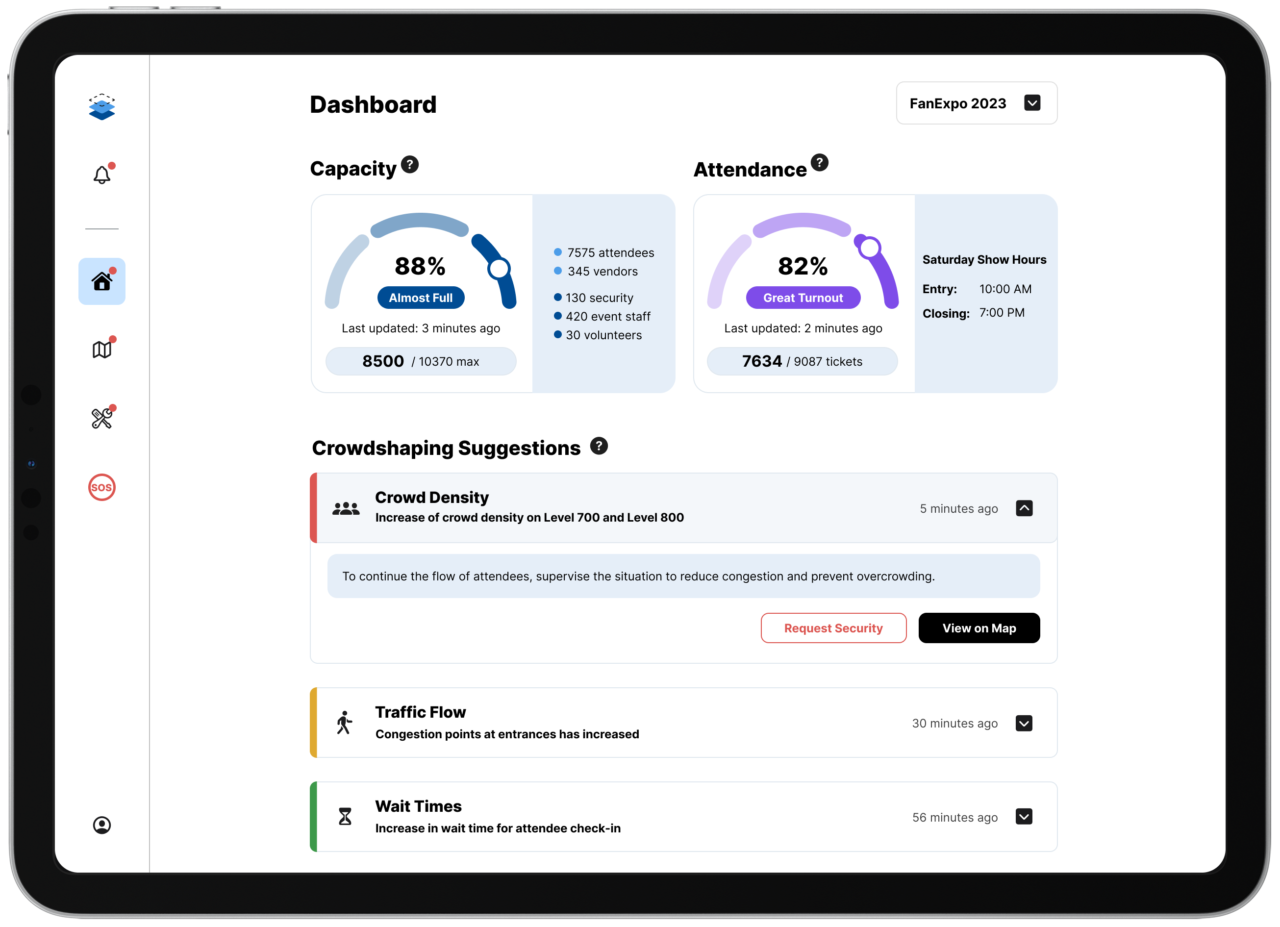
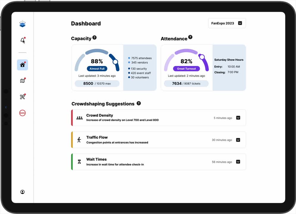
Built for planners, designed for chaos. ViVe helps you predict, prevent, and respond to what matters most.

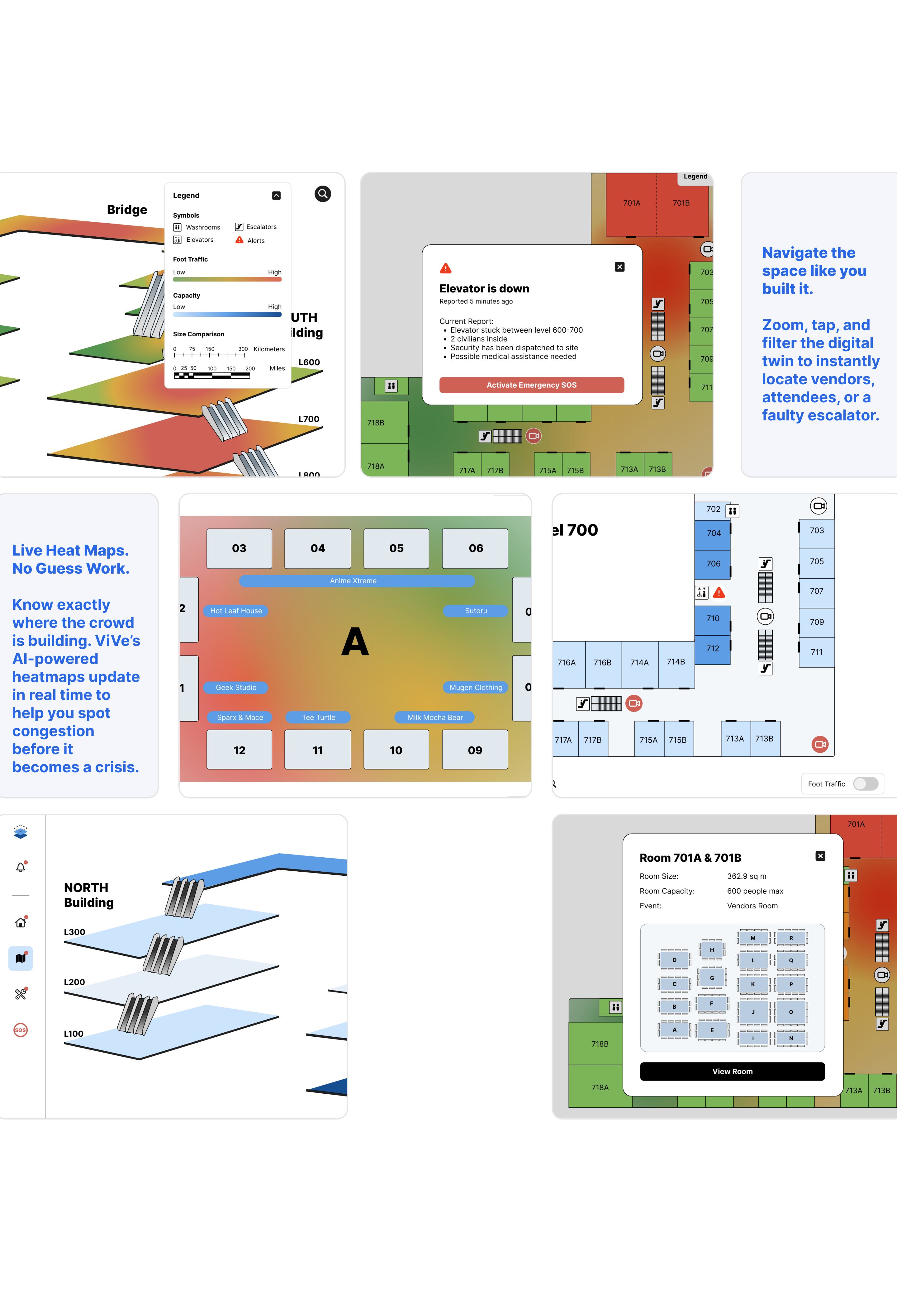
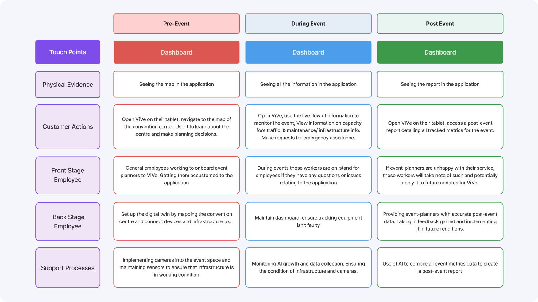
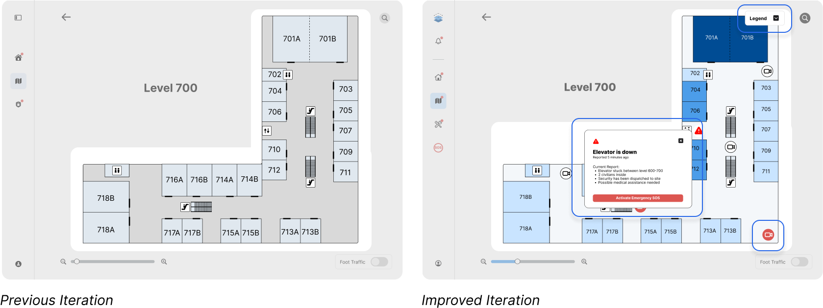
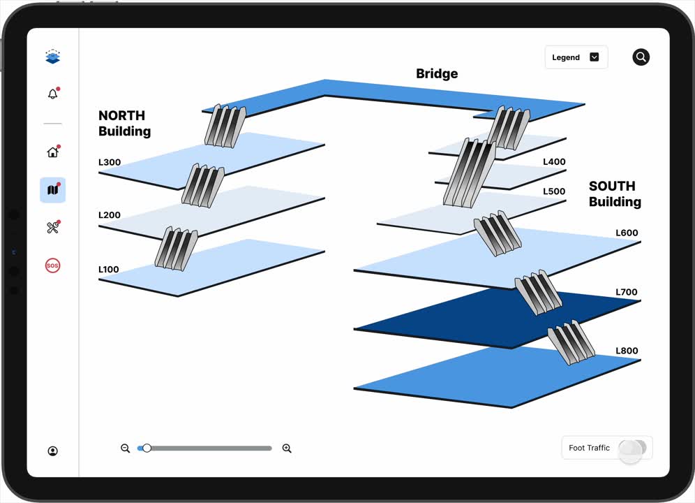
A 3D Map You’ll Actually Use

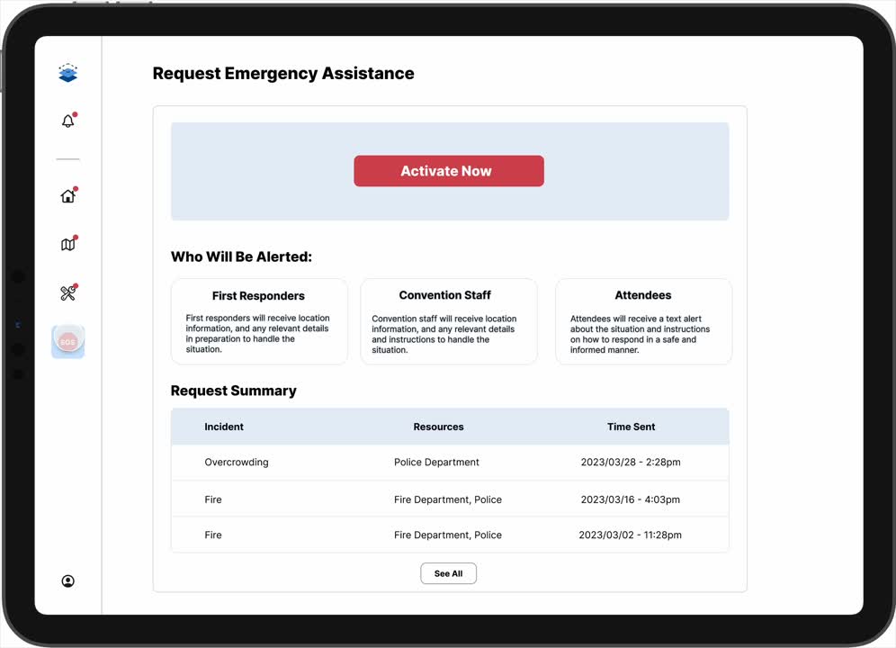
SOS Mode That Actually Helps

One tap. Autofill alert. Help on the way.

ViVe’s emergency system notifies responders instantly  and shows attendees what to do in seconds.

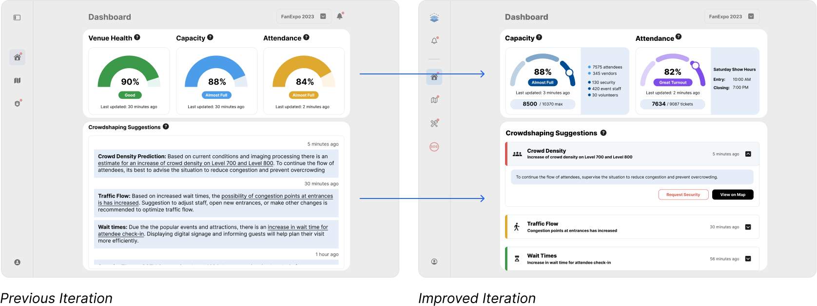
Built-In AI. Built for Real Life.

ViVe learns from previous events and current conditions to recommend smarter layouts, safer flows, and fewer surprises.

From Overwhelmed
to Organized: Reimagining Event Planning

Timeline
January – April 2023
4 months of product research, testing, iteration, and stakeholder presentations
Role
Design lead, UX Researcher
Tools
Figma
Google Suite
MS Teams/Discord
Spline
Team
Michelle Nguyen (Product Manager, Design)
Iqra Malek (Research, Business)
Katherine Kotsos (Product Manager, Design)
Ibraheem Siddiqui (Research, Business)

Capstone x Rogers 5G

Where Cutting-Edge Meets Everyday Challenges

VirtualVenue (ViVe) is a B2B digital twin platform for event planners and venue staff to manage large-scale conventions with real-time insights. Designed as a tablet application it brings AI, Internet of Things, and 3D modelling together to solve real challenges in crowd control, infrastructure monitoring, and emergency response.

This project was developed as part of my final capstone at the University of Waterloo, in collaboration with the Stratford School of Interaction Design and Business and Rogers 5G Create Lab. Over four months, our team tackled the challenge of turning cutting-edge 5G and digital twin technologies into a practical, user-friendly solution for convention centers.

My Role

As Lead Product Designer, I was responsible for:
  • Ideation & user journey mapping
  • Wireframing and interaction design
  • Visual design and brand identity
  • Prototyping in Figma and 3D layout concepts
  • Conducting usability testing and implementing iteration feedback
I collaborated closely with researchers and business analysts to ensure that every design decision addressed real user pain points and business viability.

Context & Background

This project was developed in collaboration with Rogers 5G Create Lab, with a focus on utilizing digital twin technology: virtual replicas of physical spaces enhanced by live data streams for practical, real-world impact.
CLIENT CHALLENGE
Design a digital product or service that applies digital twin and 5G technology to improve experiences in one of these domains: Education, Transport, Service design, Workspaces, Homes, Retail, Entertainment, Public spaces
We chose to focus on public spaces due to the growing need for safer, more organized events and the real, ongoing challenges faced by both companies and consumers. Specifically, we targeted the convention center and large venue industry, which continues to face persistent, high-impact issues such as:
Despite the rise of smart cities and real-time data, the event planning industry remains under-digitized. “Time is the most precious asset for event planners,” yet no unified platform existed to manage space, safety, and staff in one place.

Defining the Core Problem

Digital twins are powerful, but abstract. We needed to answer:
How do we make digital twin data meaningful and actionable for end-users?
What data is most critical for safety, navigation, and responsiveness?
How can this technology support real-time decision-making, not just passive monitoring?
THE CHALLENGE
How might we make event planning in convention centers more efficient, safer, and more meaningful for both attendees and organizers?
Large-scale events especially in venues like the Metro Toronto Convention Centre are complex, high-stakes operations. From overcrowded hallways to elevator malfunctions, even small disruptions can spiral into serious safety concerns. Yet, event planners and venue staff often rely on fragmented tools, outdated communication methods, and limited real-time insight–so we set out to build a tool that could change that.

Project Goals

We built VirtualVenue with three key goals in mind:
Increase Safety
Reduce risk of crowd crushing and bottlenecks
Improve cellular connectivity in densely packed areas
Increase Safety
Provide faster, clearer communication for event staff and first responders
Enable staff to trigger and track emergency alerts directly in the app
Enable Real-Time Monitoring
Collect and surface live crowd and infrastructure data
Use AI to suggest crowd-shaping tactics
Push maintenance alerts instantly to reduce downtime
At its core, this project aimed to deliver an event experience that feels organized, safe, and effortless, even under pressure.

Research & Insights

Before we could design a solution, we needed to understand two things:
Why do events break down AND what tools do planners actually need to stay in control?
We started our research by diving into the reality of large-scale public events, using a mix of case studies, secondary sources, and interviews to ground our insights in real-world failures.

Real-World Events That Shaped Our Thinking

The idea for VirtualVenue was grounded in real, high-impact failures in crowd safety and infrastructure communication. Using secondary research and case study methods, we examined past crowd disasters, like the Itaewon crowd crush tragedy, and system failures such as the Rogers Centre outage, to uncover root causes:
Itaewon Crowd Crush
A tragic Halloween gathering in Seoul turned deadly when more than 150 people lost their lives in a crowd surge within a narrow alleyway. The lack of predictive systems, real-time monitoring, and coordinated response played a significant role in the scale of the disaster
Rogers Nationwide Outage
A nationwide Rogers network failure left millions of Canadians, including venue staff and emergency services, without communication. At places like the Rogers Centre, teams struggled to manage large events without internal systems to fall back on
Facing Reality
  • Lack of clear evacuation routes
  • Poor visibility into infrastructure health
  • Communication breakdowns between security teams
  • Over reliance on analog tools (e.g., radios, walkie-talkies, WhatsApp)
Highlighted the need for a tool that could monitor crowd density in real time and alert staff before a situation becomes critical
Emphasized the importance of venue-specific infrastructure monitoring and internal communication tools not dependent on public networks
Using case studies of real events showed how our solution could help and added a big layer of legitimacy for our stakeholders to understand the problem.

We also explored how tech-enabled venues were using tools like IoT and AI for live monitoring but noticed these solutions were often surveillance-focused, not planner-friendly.
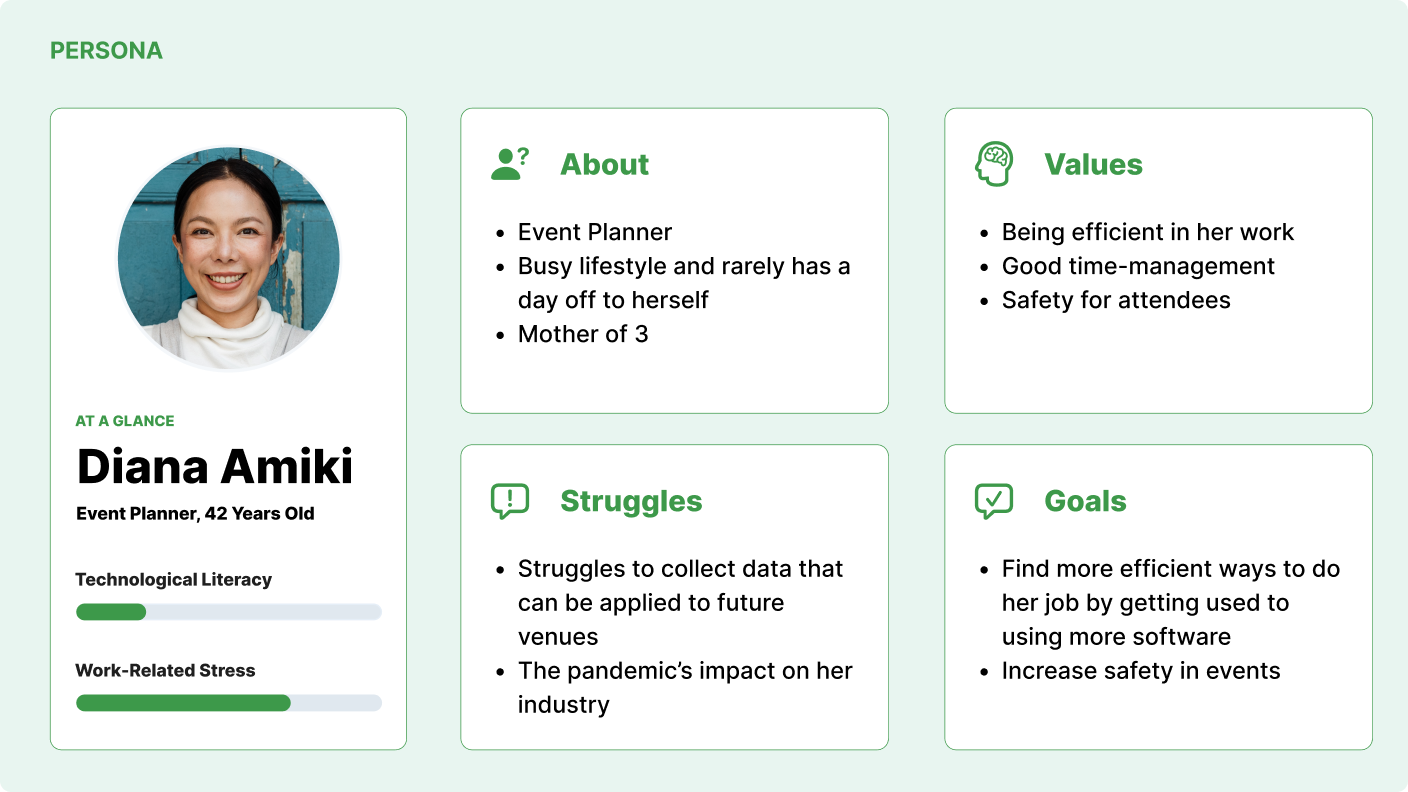
“Time is the most precious asset for event planners. In the absence of integrated tools, managing uncertainty becomes a source of constant stress.”

User Interviews: Insights From the People Who Keep Events Running

To bring these insights closer to home, we conducted think aloud protocol interviews with security staff at the Metro Toronto Convention Centre and the Air Canada Centre. We chose to do user interviews instead of methods like surveys since they would be too open ended if we asked for prospective features to add.

Here’s what we learned from those on the ground:
Most communication happens manually (word of mouth or fragmented chats)
Escalator and elevator breakdowns are common, but not flagged centrally
Crowds often build silently in hidden corners of the venue
In emergencies, public alerts must be carefully controlled to avoid panic
Personnel need to know
exactly where to go, what resources are nearby, and how severe the issue is
AIR CANADA CENTRE HEAD OF SECURITY SHARED:
“We don’t have enough real-time information in one place. The right people often don’t know the issue until it’s already a problem.”

Defining a User: Diana

From our research, we shaped our primary user:
Diana, a detail-oriented event planner responsible for planning, adapting, and executing large-scale events.

Creating a persona and having her story helped the team guide our feature prioritization, and communicate our vision to stakeholders.

Competitive Landscape: Standing Out in a Crowded Space

We analyzed existing tools like Crowd Dynamics and Milesight, which use IoT for crowd tracking. However:
They focus on surveillance, not real-time collaboration
They don’t address the planner’s workflow or infrastructure visibility
They lack interactivity and real-time input from staff on the ground
Based on our secondary research, we saw that the crowd management software market was growing, but still largely untapped, especially in the context of large-scale event planning. While many existing solutions focus on hardware or surveillance, VirtualVenue takes a software-first approach, leveraging those tools to solve real, human-centered problems in event coordination.

Our competitive edge? VirtualVenue goes beyond passive monitoring as it’ll enable real-time coordination, AI-driven crowd predictions, and a planner-first design focused on safety and operational efficiency. What truly sets us apart is our emergency response integration, giving teams the tools to act fast, communicate clearly, and protect attendees when it matters most.

Key Insights

From our research, three big insights stood out:
Safety issues are often a communication problem, not just a crowding problem
Event planners need tools that guide, not overwhelm—simplicity matters
Crowd data is important, but infrastructure visibility (ex. elevators, alarms, temperature sensors) is equally essential
These findings directly shaped our design strategy—focusing not just on what data is collected, but how it’s visualized, prioritized, and acted upon

Product Vision

VALUE PROPOSITION
“A one-stop platform for event planners to monitor, manage, and respond to real-time issues—all through a digital twin of their venue.”
We ran multiple brainstorming and planning sessions to define the MVP experience:
Heatmap overlays for live foot traffic tracking
Maintenance dashboards for escalator, elevator, and alarm statuses
Emergency assistance with autofill alerts and responder directions
AI suggestions for crowd control, based on historical and real-time data
Each feature was mapped to a pain point that surfaced in our research

Designing for Two Realities: Before and During the Event

We knew from our research that the biggest stressors for planners happen both before an event (during layout planning) and during it (when emergencies and breakdowns occur). So we designed VirtualVenue to support both use cases:
Pre-Event Planning
Visualizing the venue, placing booths, anticipating congestion with AI-powered simulations
Live Event Management
Monitoring real-time data, managing alerts, and responding to emergencies with speed and clarity
To maximize portability and visibility, the product was designed for tablet use, optimized for quick taps and at-a-glance decision-making. Minimalist visual design and a clear hierarchy were non-negotiables for accessibility across staff roles

Enabling Technologies: Powering ViVe with AI, IoT & 5G

VirtualVenue isn’t just a dashboard—it’s a smart ecosystem made possible by the integration of AI, IoT, and 5G connectivity. To enable our solution, we leveraged:
Internet of Things (IoT)
Creates a cloud system to house all data collecting cameras and sensors to connect physical infrastructure (elevators, escalators, alarms, and thermal cameras) directly to our software

→ a real-time feedback loop that allows for monitoring, alerts, and predictions
Artificial Intelligence
AI uses data to detect patterns in crowd behaviour and infrastructure performance

→ Using heat sensors, foot traffic data, GPS, and equipment status, ViVe can suggest proactive steps for crowd control and flag high-risk areas before issues arise
5G Mobile Networks
With 5G connectivity, all of this information updates live, ensuring that event planners and venue staff can act instantly

→ Transforms planning and safety experience that no competitor currently offers due to real-time data points and trasnfer speeds

Service Blueprint: Before, During, and After the Event

A high-level look at how ViVe supports users across the full event lifecycle from pre-planning to real-time monitoring to post-event analytics.

After the event a generated a detailed report of all activity will be given (e.g. crowd patterns, alerts triggered, SOS events). This data is fed back into the system to improve smart assist predictions and optimize planning for future events.

Wireframing & Prototyping

Timeline

This project followed a fast-paced timeline with multiple deadlines for presentations, iterations, feedback, implementation, and design. Below is a quick breakdown of what was expected all within less than 8 weeks.

From Flow to Framework

Before jumping into design, our team outlined Phase 1 and parts of Phase 2 of the MVP prototype. We also identified key screens we wanted to expand on. To align our vision, we created a shared moodboard and feature list, which helped us break down tasks and delegate work effectively across our team of three designers.

Wireframe & Iteration 1: Where Concepts Meet Reality

We created wireframes and started with low-fidelity screens that focused on clarity, simplicity, and modular navigation. Key priorities included:
  • An intuitive and clean dashboard that would display live KPIs (capacity, attendance, crowd health)
  • A map interface with toggles for layers like heatmaps, cameras, and maintenance
  • Persistent alerts that could be seen on every screen

Usability Testing & Iterations

Testing Methodology: How We Gathered Feedback

We pitched our MVP to 6 stakeholders, over 30 students, and conducted initial user testing with both students and the Head of Security at the Air Canada Centre. The feedback we gathered was critical in shaping our next steps. After applying those insights to our low-fidelity MVP, we conducted two additional rounds of scenario-based usability testing using our high-fidelity screens, with over 10 participants including students, professors, and venue security professionals.

Using a story-driven walkthrough, participants took on the role of an event planner managing:
  • An elevator malfunction
  • An overcrowding issue
  • A live emergency using the SOS feature
This method helped us evaluate the usability, clarity, and responsiveness of the prototype in realistic, high-pressure situations.

Feedback revealed both what worked and what needed attention.
What Users Loved
Real-time heatmaps that visualized crowd density
Maintenance breakdown alerts by floor and system
Autofill emergency requests that made responses fast and focused
The ability to "just tap and act" – no guesswork needed
Key Challenges
Navigation between map and maintenance was clunky
Alerts weren’t visually strong enough
Capacity vs. attendance confused some users
AI suggestions were too text-heavy
Icons and interactivity weren’t always intuitive
Stakeholder Feedback
Positive Highlights:
  • “Professional quality. Your visuals clearly show how intuitive the system is.”
  • “The maintenance page is a standout—it highlights the real value of 5G for venues.”
  • “I love that the app feels like it does the hard work for you.”
Constructive Insights:
  • Clarify the sensor and data ecosystem behind the digital twin
  • Add a confirmation step for emergency dispatches to prevent accidental sends
  • Think about how this expands to other venues and event types
  • Refine the interface for easier multitasking and layered responses

Main Design Changes

In preparation for our final presentation that we delivered in front of 3 Rogers stakeholders, 3 faculty members from the Stratford School of Interaction Design, and fellow student teams, we consolidated all feedback from our usability testing rounds to make these key design improvements:
Dashboard
Navigation Bar
Icons were refined for clarity to make navigation more intuitive and reduce ambiguity

Notifications and the SOS button were relocated to the navigation bar, ensuring these critical functions are always visible and accessible to the user
Simplifying Insights for Clarity
Streamlined the dashboard to display only the most essential and actionable information

Transformed AI suggestions into visual summaries with a clearer visual hierarchy
→ Alerts are now more scannable at a glance, and users can tap to expand them for more context and guided next steps
Floor Plan/Map
Clearer Visual Cues & On-Map Alerts
Even when heatmaps are off, rooms remain colour-coded to reflect crowd density for quick visual reference

A legend was introduced to support new icons and guide users through the updated map interface

Alerts and camera icons are now clearly visible and change colour when issues arise
→ Tapping on them reveals a detailed summary of the incident, along with an option to trigger the SOS feature if needed
Maintenance
Less Clutter, More Impact
I simplified the maintenance dashboard by removing or relocating low-priority stats like temperature and air ventilation that took up unnecessary space and didn’t add meaningful value in most scenarios

To reduce visual clutter, I improved the hierarchy so that critical alerts are now more prominent and easier to scan

We also moved certain metrics to more relevant screens, making the maintenance view feel less cramped and more purposeful, helping users focus on what actually needs attention
Emergency SOS
Rethinking the SOS Experience
We moved the Emergency SOS feature to its own screen, giving it a dedicated multi-step flow where users can clearly input all necessary details before alerting emergency services

Previously, users weren’t sure how severe a situation was—or how to respond
→ By introducing a message field with pre-written templates, we streamlined the process, enabling faster and more accurate communication during high-stress moments

Visual & Interaction Design

We designed VirtualVenue with a minimalist, purposeful UI to keep users focused in high-stress environments. Every visual element was crafted to support clarity, accessibility, and ease of use.

Key Design Principles:
High-contrast colours and subtle animations to draw attention to urgent alerts
Colourblind-accessible icons and codes, with plans for grayscale support
A 3D map interface structured for fast, room-level comprehension
Scalable layouts designed for tablet usability and cross-role workflows

Style Guide & Design System

To ensure consistency across the system, I created a comprehensive style guide and component library in Figma. This helped streamline collaboration and keep the design cohesive throughout development.

I also led our branding direction, drafting several logo concepts—one of which was selected by the team as the final design. That logo became our official app icon and visual anchor for VirtualVenue.
Branding
Our branding choices for typography and colour were guided by a focus on clarity and scannability. We chose blue as the primary colour because it conveys a sense of trust, calm, and professionalism—qualities that are essential in high-stakes environments like event planning and emergency response. The overall aesthetic remains clean and minimal to ensure information is delivered quickly, clearly, and without distraction.
Typography
Colours
Brandmark & Logo
My vision for the logo was to reflect both the layered complexity of running an event and the physical structure of multi-level venues. The segmented, broken lines symbolize flexibility making the mark feel modular, editable, and adaptable across use cases.
Components
To maximize efficiency and maintain consistency, I created a library of reusable components and variants for the most commonly used elements. This included:
  • Navigation bar
  • Pop-ups
  • Buttons & Drop downs

Final Design

VirtualVenue (ViVe) is a tablet-based digital twin platform that helps event planners monitor infrastructure, predict crowding, and manage emergencies in real time.

Designed for clarity and control, ViVe empowers users to respond quickly without being overwhelmed. Every screen was built with intention, tested with real users, and refined for high-pressure use.

Here’s a look at the final experience:

A powerful control center, in your hands.

Our refined prototype brought together a suite of focused, intuitive tools for real-time event planning and venue management:

Reflection & Impact

That’s a Wrap!

The final iteration of VirtualVenue delivered a functional, intuitive prototype that directly addressed real-world pain points in event planning and venue management. While it was designed as a capstone project and not deployed for real-world metrics, it marked a significant milestone in my growth as a designer.

This project not only concluded my university journey, it also gave me hands-on experience leading product design, managing usability testing, and iterating on feedback to create meaningful, user-centered solutions.

Key Results:
  • User satisfaction scores of 8–9/10 across testing rounds
  • Praise from Rogers for its utility, especially in emergency response and real-time venue insights
  • Final prototype enabled users to predict, prevent, and respond to issues with clarity and control

Stakeholder Feedback

Our work was praised for both its innovation and relevance, especially in light of increasing public safety concerns and the logistical challenges of post-pandemic events.
“An innovative and relevant solution. Your walkthrough made it easy to understand how the platform works and why it matters.” – Rogers Stakeholder

“Great UI clarity and detail. You clearly solved a complex issue with a focused tool.” – Faculty Advisor

“Easy to understand walkthrough of your UI. Great use of persona-driven storytelling.” – Leah (Professor)

“Great use of small animations in your demo. It really helped bring the prototype to life.” – Scott (Professor)

Areas for Further Development

There were several areas the team could continue to improve on, and I aspects I would want to for future iteration. Stakeholders also provided thoughtful critiques that would guide next steps in refining and scaling ViVe:

As lead designer, I learned to:

Translate technical systems (AI, IoT, 5G) into intuitive UX
Drive value by narrowing scope and prioritizing core features
Emergency assistance with autofill alerts and responder directions
AI suggestions for crowd control, based on historical and real-time data

Thanks for reading!
Want more?