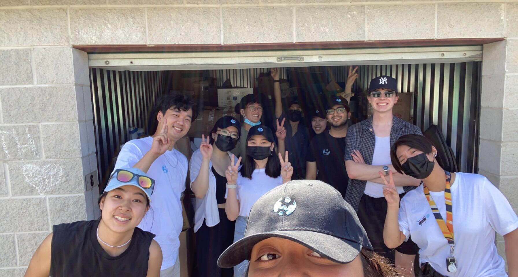
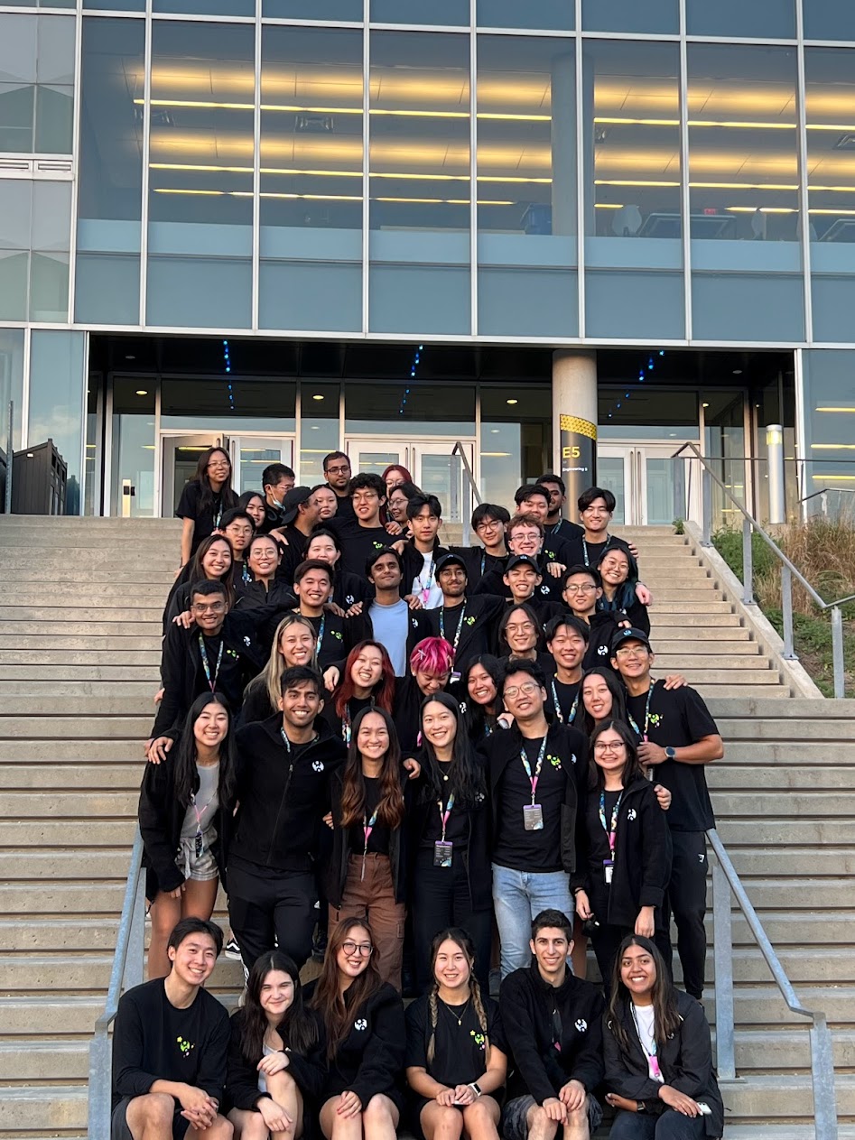
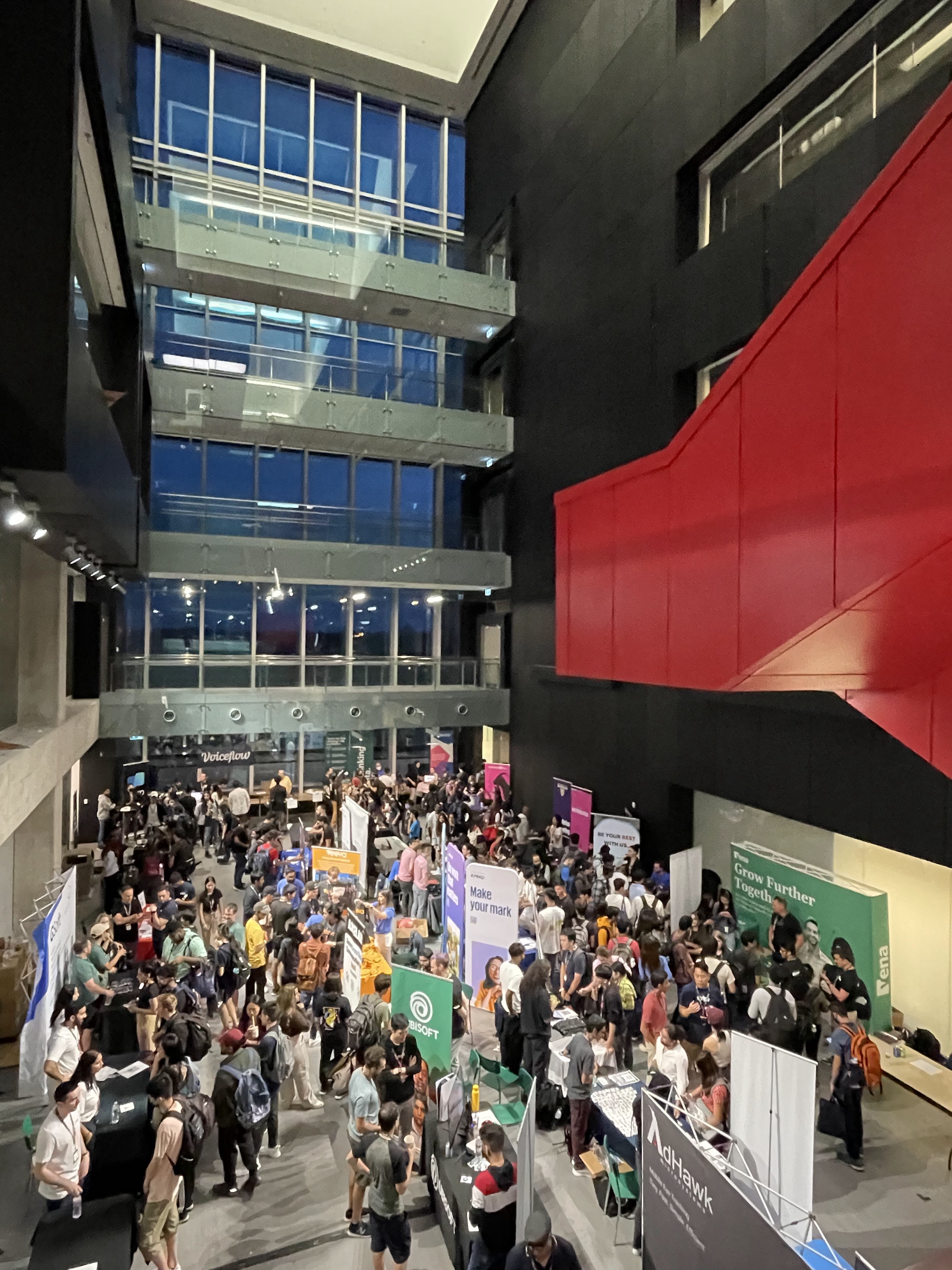
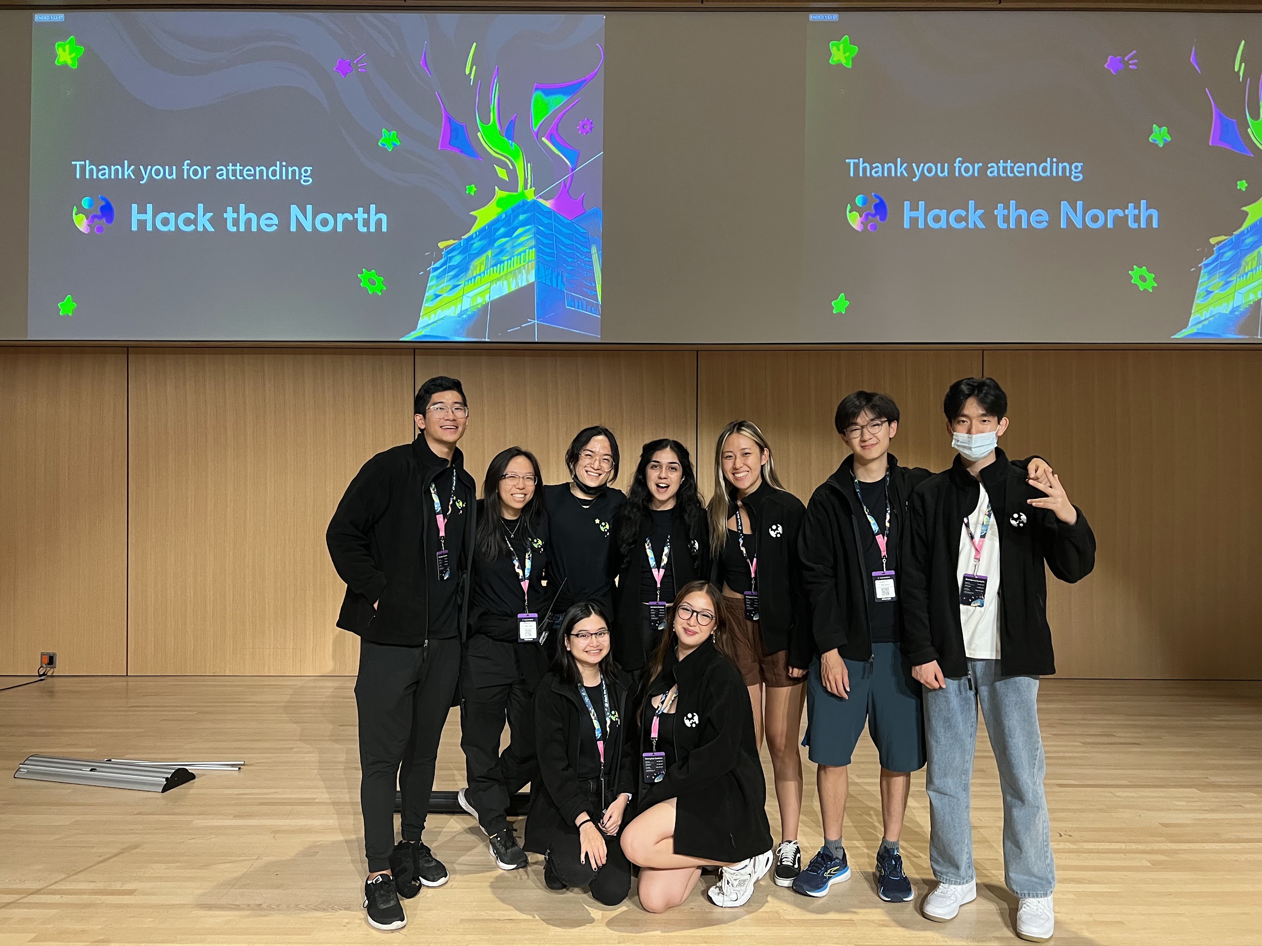
The Hack the North Experience

Bringing Canada’s biggest hackathon to life with visual design across web, applications, and end-to-end event experience design
Hack the North is back in
person.
Better than ever.
With bursting animations.
Personalized hacker
application portal.
& Top Notch Social Presence

From Pixels to People: Designing for 1,000+ hackers

Timeline
March - October 2022
Role
Graphic Designer, Design Team
Tools
Figma
Adobe Suite (PS, Ai, AE)
Lottie
Procreate
Google Suite
Notion
Team
Rachel Xu (Design Lead)
Wilbur Zhang (Graphic Designer)
Yinan Zhang (Product Designer)
Kelvin Zhang (Product Designer)

Designing in a Student Run Organization

Hack the North is Canada’s largest student-run hackathon, hosted annually at the University of Waterloo. In 2022, the event made its return to an in-person format for the first time since the pandemic, welcoming over 1,000 hackers from around the world.

As a graphic designer, I played a key role in refreshing the brand identity and amplifying the excitement of our in-person comeback. From web animations and hacker portal illustrations to social campaigns, I helped shape a cohesive, multi-platform experience that made it unmistakably clear: Hack the North is back and better than ever.

How I Drove Impact Through Design

Setting the Stage
Refreshed launch assets across platforms to introduce Hack the North 2022
#1
engagement post in the last two years
Date Launch Instagram Post
Animating
the Brand
Brought the website to life with playful, looping animations optimized with engineers using After Effects and Lottie
Praised by sponsors and hackers for new dark-mode site
“The website looks amazing”
Turning Brand into Buzz
Created cohesive Instagram grids and campaign assets that drove record-breaking organic engagement and follower growth
16K+ Instagram accounts reached in 6 days
Designing the Journey
Crafted a personalized, illustration-driven Hacker application experience that engaged applicants worldwide
1,000+ hackers welcomed in person
4.7k+
applications submitted
Reaching 94 countries and 36k total site views
Shaping the Experience
Designed event graphics and supported Opening & Closing Ceremonies

Brand Strategy & Discovery

Each year, Hack the North reinvents its visual identity to bring a fresh and memorable experience to its hackers. In 2022, the design challenge went beyond style—it was about reintroducing Hack the North as an in-person experience after two years of virtual-only events.
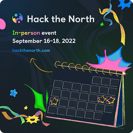
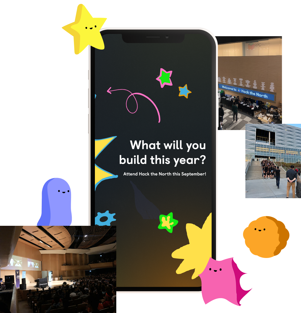
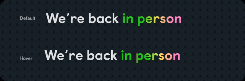
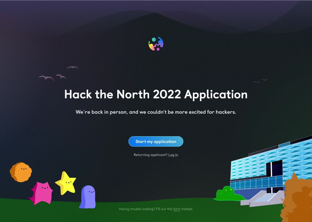
“We wanted it to be super clear: Hack the North is back in person—and it’s going to be big.”

Collaborative Brainstorming

At Hack the North, rarely is it individuals or only sub teams coming up with ideas, it really is a team effort. Our creative direction started with teamwide FigJam brainstorms with 40+ organizers, where we collectively explored the tone, goals, and emotional core of this year’s identity.
We asked:
What do we want hackers to feel?
How can we humanize tech branding and move away from corporate aesthetics?
What makes Hack the North unique?
And what elements would represent the branding regarding:
Ambition
Hacker Experience
Hype + Energy
Creative + Spontaneous
In-person Event
If Hack the North were a person:
Creative.
Energetic.
Ambitious.
Spontaneous.
Quality-focused.
The brainstorms brought us to our Core Brand Themes
Innovation
A space for building and tinkering
Approachability
Clean, but never sterile
Energy & Ambition
Lightning, sparks, color, upward motion
Community
Welcoming, inspiration, learning
We emphasized imperfect lines and organic shapes to reflect creativity and approachability, moving away from overly polished, corporate visuals.

The design team went to work and began working on a brand and website that evoked:
Wanderlust
& Awe
Reaching for
the starts
The Thrill
of Creation
Like unboxing
a new toy
Movement
& Energy
Bright colours, bold type,
lightning motifs

Bringing the Brand to Life

With our brand direction in place, the Hack the North website became the first major opportunity to showcase our refreshed identity to the world. As the main hub for all hacker information from applications to event logistics, it had to capture attention instantly and feel alive. My responsibility as the graphic designer was to animate and elevate this experience through dynamic, thoughtful motion design.
“At Hack the North, animations are a fundamental part of our brand and the first thing people see when they land on our site. A great animation doesn’t just look good—it enhances the user experience and sets us apart.” – Kelvin Zhang (Product Designer & Prev. Front-end Dev)

Setting the Creative Direction

From the very first brainstorming session, we knew we wanted to avoid overused themes like outer space or generic tech visuals. Instead, we leaned into a wacky, playful, and handcrafted aesthetic, something more human, more surprising, and unmistakably us to represent Hack the North.

Using FigJam, we explored ideas like wanderlust, sparks, upward motion, and watercolour textures to emphasize a return to in-person energy. This tone would guide our visual motifs and animation direction moving forward.
Timeline & Tools
With just a month to work with, my animation process depended on close collaboration. I waited on illustrations from our design lead and graphic designer, and coordinated with the product designers to align with the final layout. I also worked closely with front-end engineers to implement the animations, going back and forth to troubleshoot issues, optimize performance, and make sure everything looked and functioned as intended.

Exploration

While the team was finalizing layout and illustration work, I started gathering inspiration and experimenting with how some of the early assets could come to life through animation. Rachel (design lead) often reminded us to consider the full user journey like how visuals and interactions guide movement through the site, where attention lingers, and what makes the experience memorable. I found myself drawn to playful looping animations, subtle enough not to distract, but full of personality and charm. These early explorations helped set the tone for the final animation style.
Moodboard
Exploring ideas in After Effects

Key Animated Sections

Once the final layout and illustrations were in place, I got to work on animating each section of the website. From past team learnings, I knew that optimizing animation performance was critical. We focused on:
  • Designing animations in vector/SVG for scalability
  • Exporting via Lottie to minimize front-end dev effort
  • Prioritizing lightweight files to maintain fast site load speeds
It took a lot of iterations with tweaking keyframes, gathering feedback, and fine-tuning the motion until everything felt just right. It was definitely a challenge, but the end result brought the site to life in a way that made all the effort worth it.

Here are the key animations I created:
Hero Section
I animated our main illustration (created in Procreate by Rachel) by breaking it into layers, elements, and building a watercolour reveal effect in After Effects. Sparks emerge behind the E7 building, followed by subtle looping stars and rotating gears to maintain visual interest. Each illustraion was individually animated.
UW Engineering Section
Using Wilbur’s playful illustration of the box and goose, I designed a parallax-style animation to simulate depth and interaction with scrolling. This was a collaborative implementation with a front-end developer, leveraging lightweight code-based movement for performance.
Supporting Animations
I also created subtle motion enhancements across the site to add polish without distracting from content:
  • Scroll-triggered arrows and section transitions
  • Title reveals and footers
  • Playful hover states and motion graphics

Challenges & Constraints

Creating performant animations with assets originally built in Procreate posed challenges as raster-based illustrations were heavier and harder to export as vector-friendly SVGs. We ran into limits with Lottie not supporting certain After Effects features, and file sizes for some animations exceeded 5MB—far above our target of 300KB.

Despite this, I optimized and compressed every asset, eventually reducing the final hero animation down to 1.5MB, achieving a balance between performance and visual richness. While 1.5MB is still outside of our target, the developer and platform teams were able to optimize and carry out all animations making them just a bit smaller (thank you lovely teammates!).

Outcome & Impact

Time to reveal Hack the North 2022 to the world! The website launched with our refreshed brand and all its energy, on full display. Departing from the soft pastel palettes of past years, we introduced a bold, dark-mode design full of motion, sparks, and hype to celebrate the return to in-person hacking.
“The website looks amazing.” – Sponsor

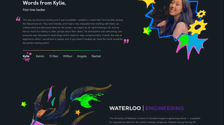
“Everything needs good design, and good design lasts. Like this site!” – Hacker
Beyond the visuals, the animations helped set the tone for the entire event by building anticipation, guiding attention, and making it immediately clear that Hack the North was back and better than ever, and ready to welcome hackers in person with excitement and polish.

Designing a Personalized Hacker Application Experience

With the new brand identity established and our website animations capturing attention, the next big key touchpoint was the Hacker Application Portal—the place where over 10,000 hackers would submit their applications to attend Hack the North 2022. Working alongside Yinan, one of the product designers, I set out to create a personalized, visually cohesive, and joyful application experience that would feel like the start of an in-person adventure.
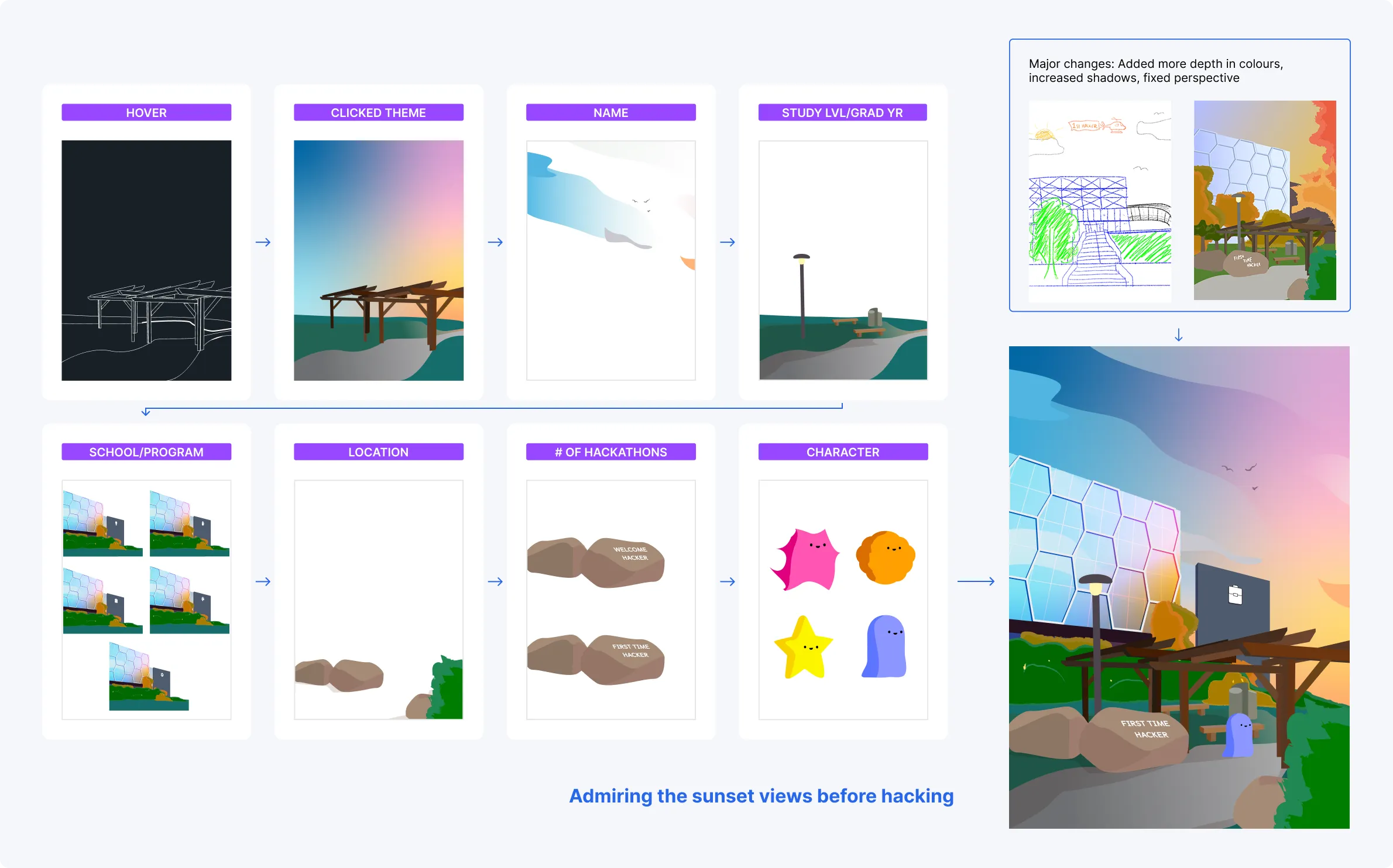
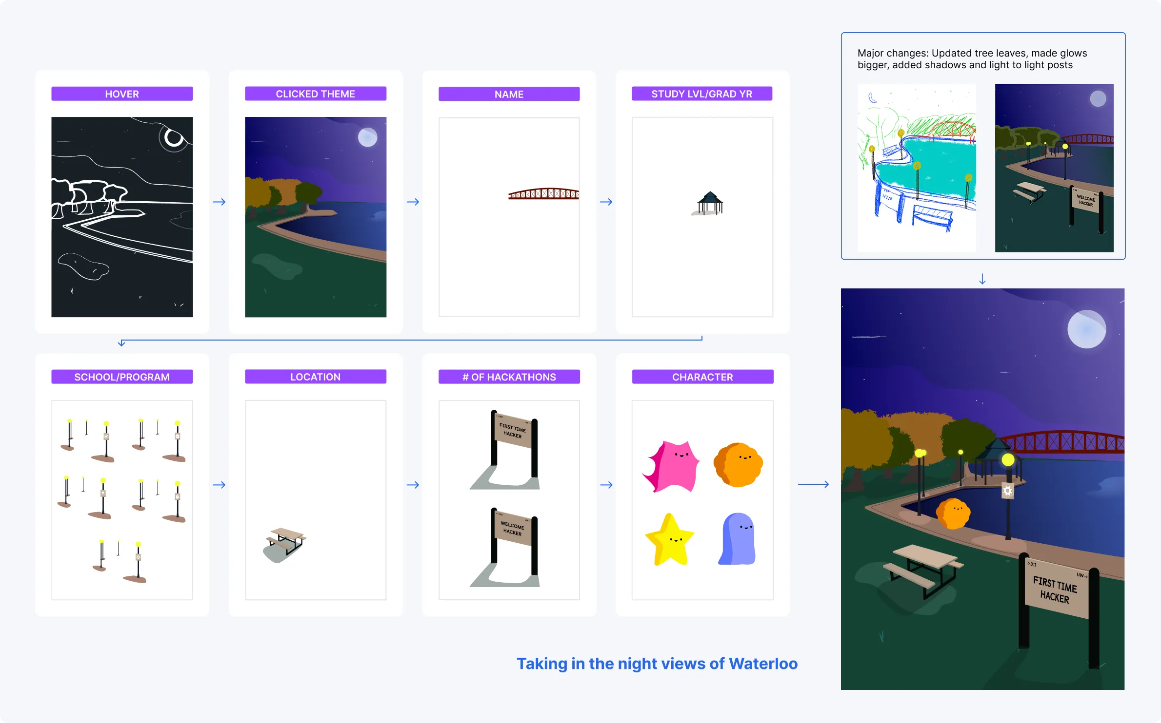
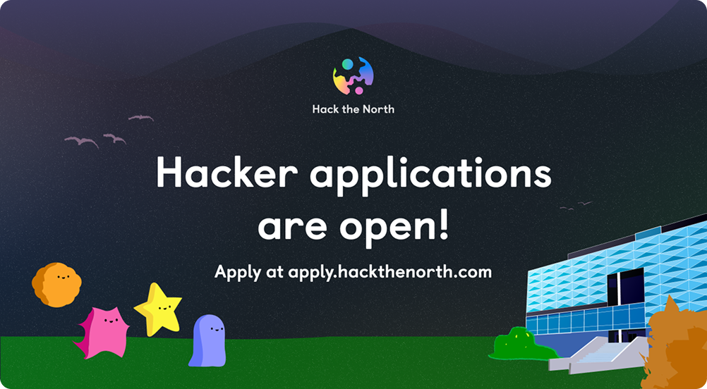
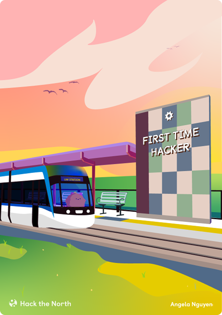
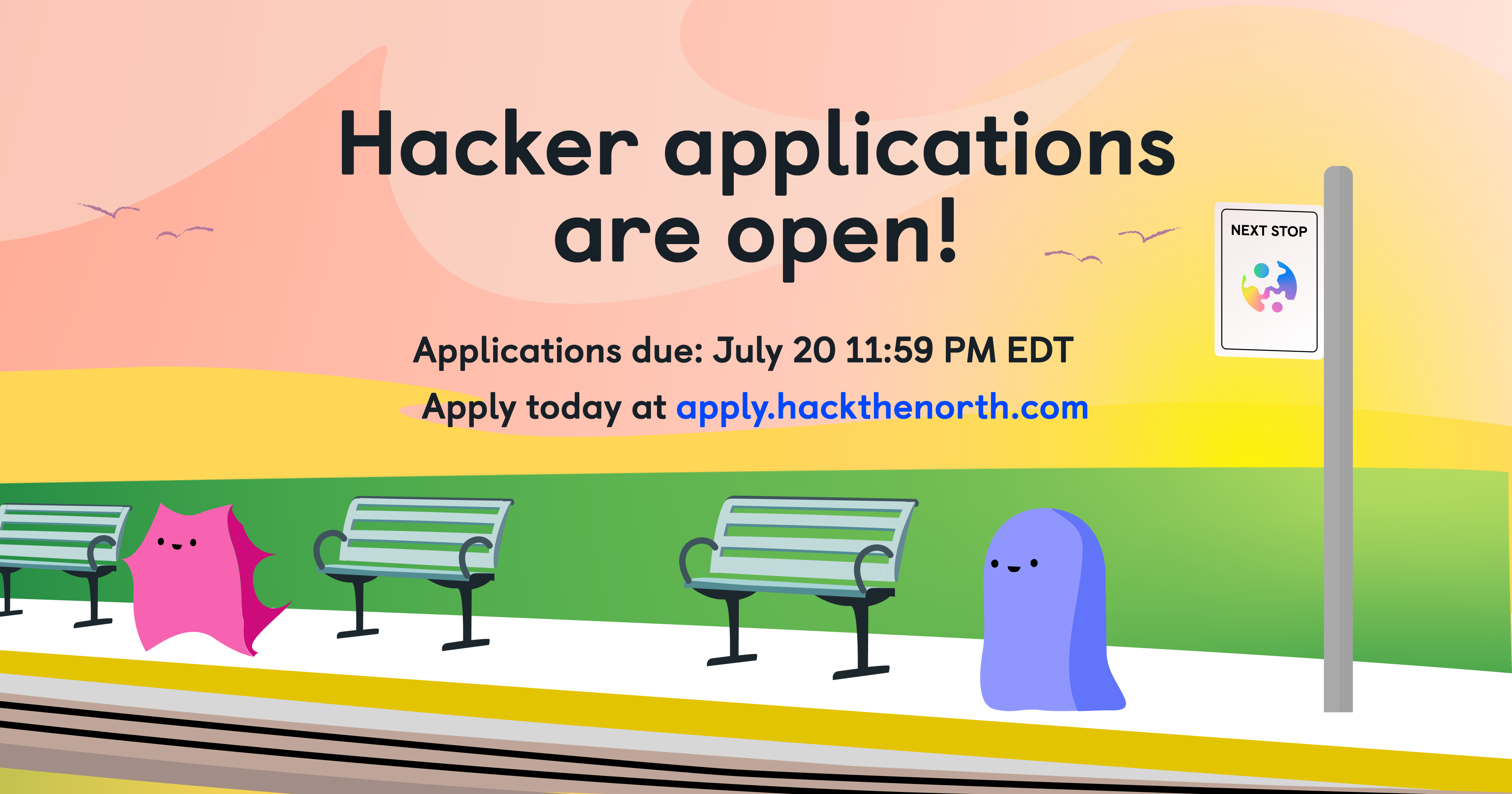
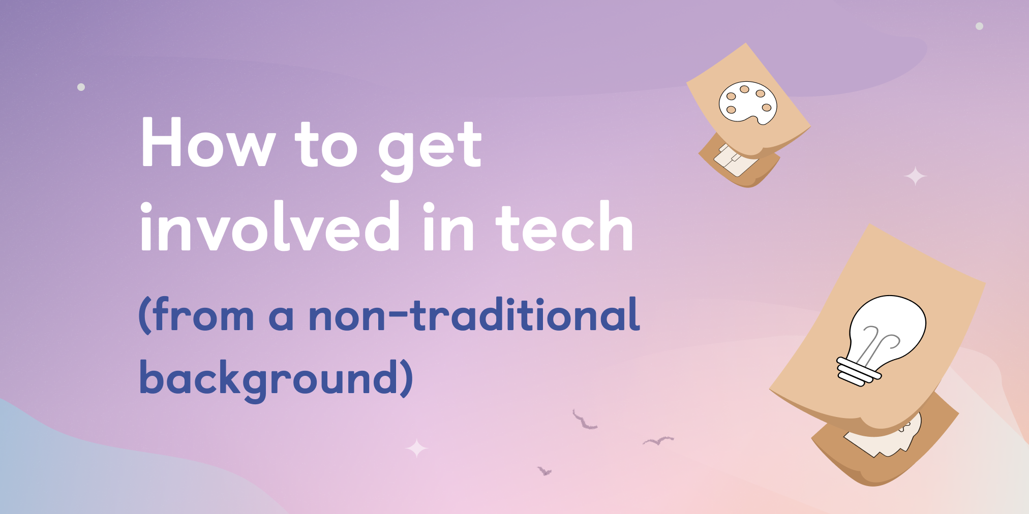
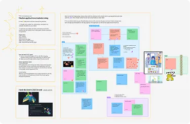
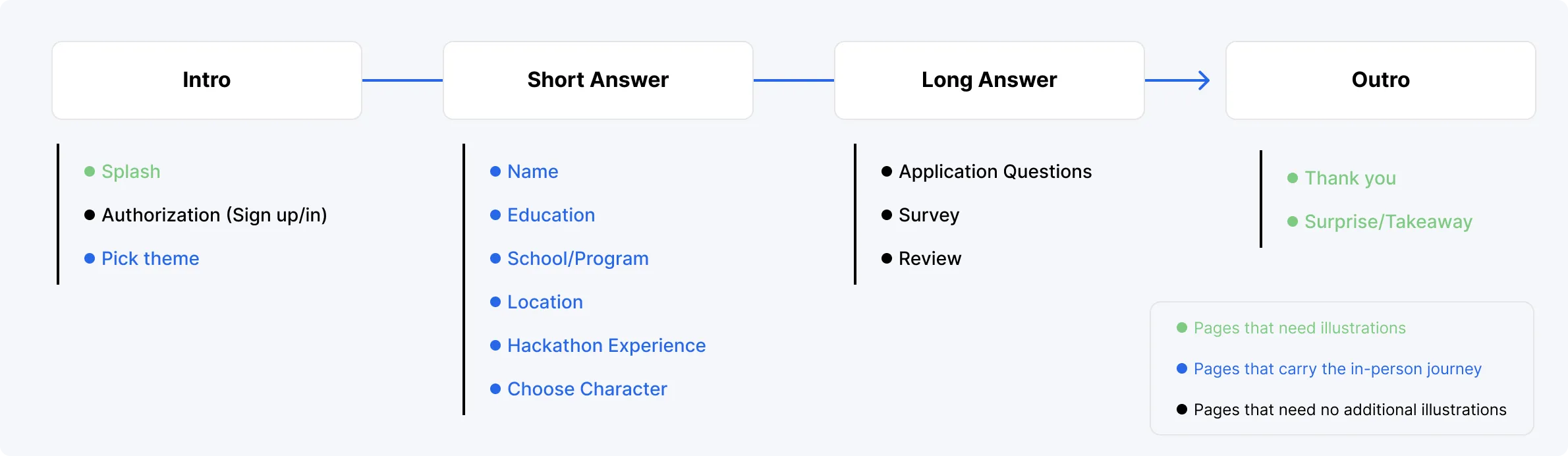
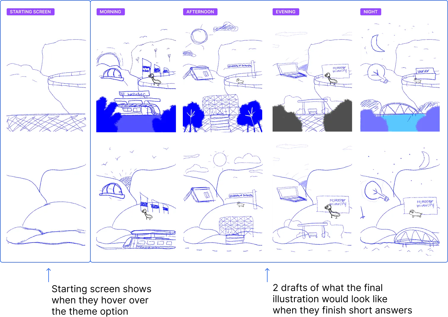
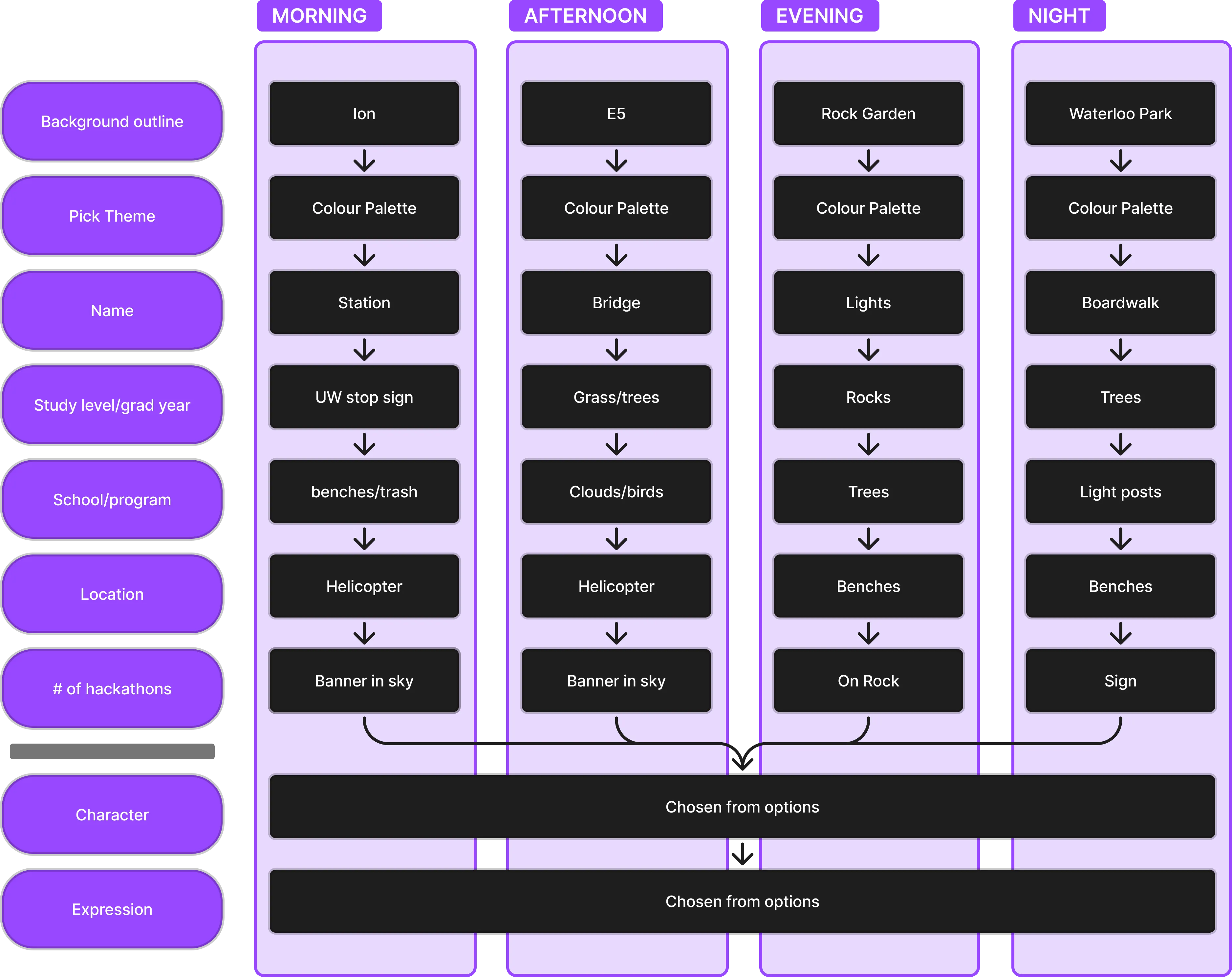
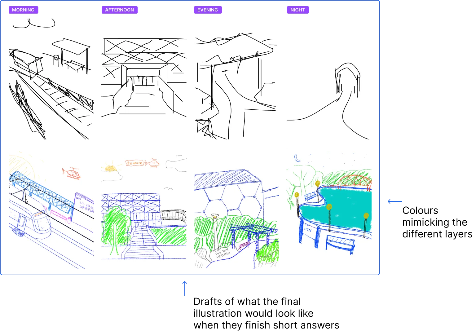
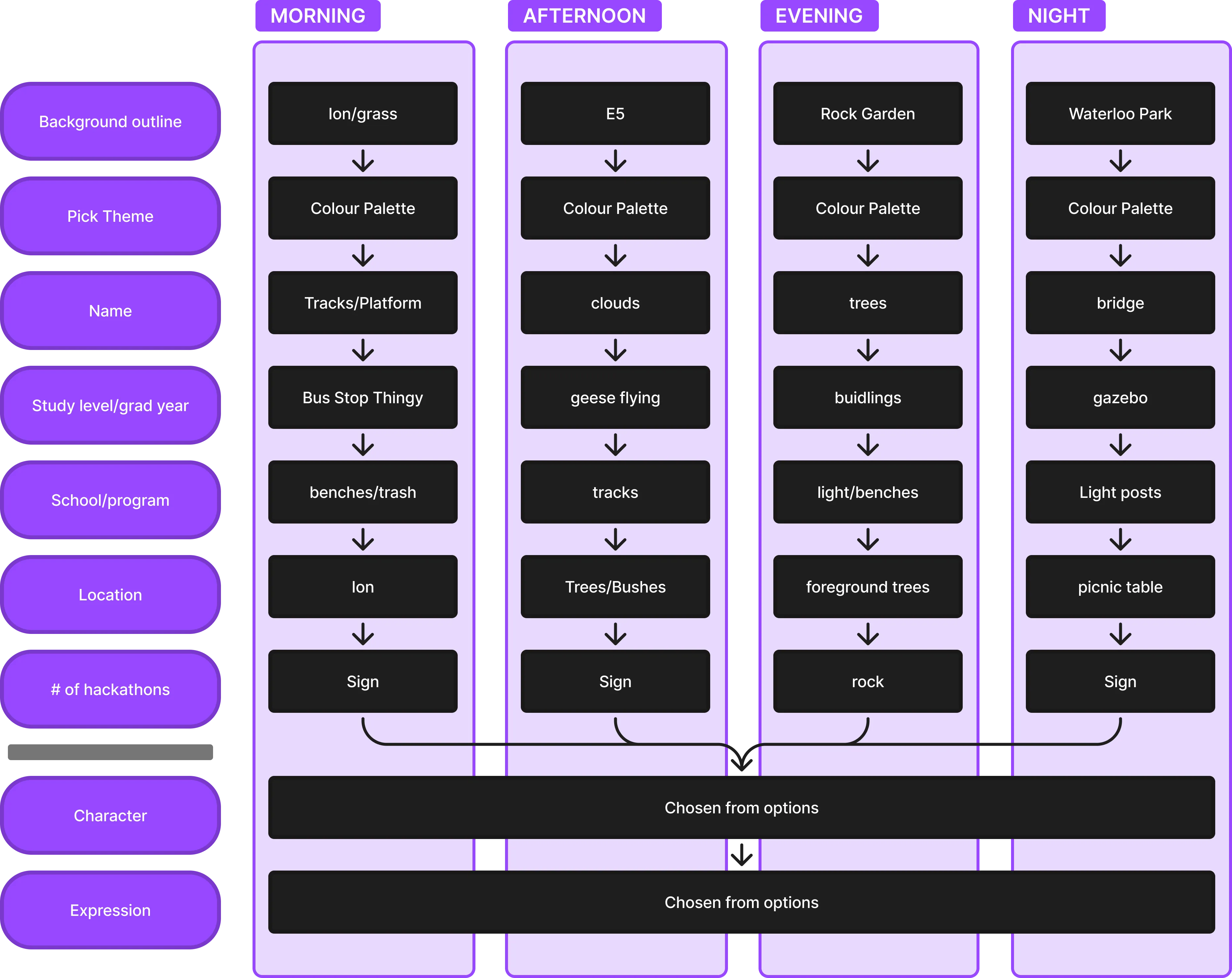
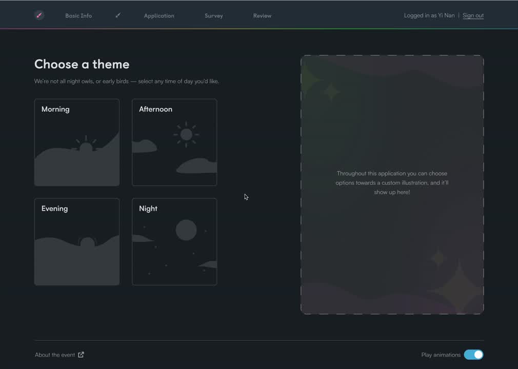
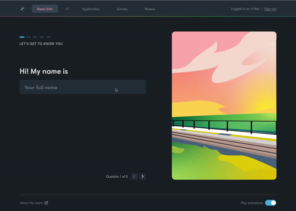
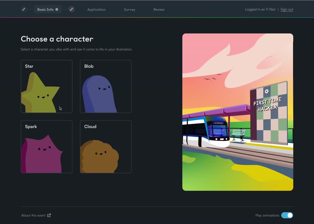
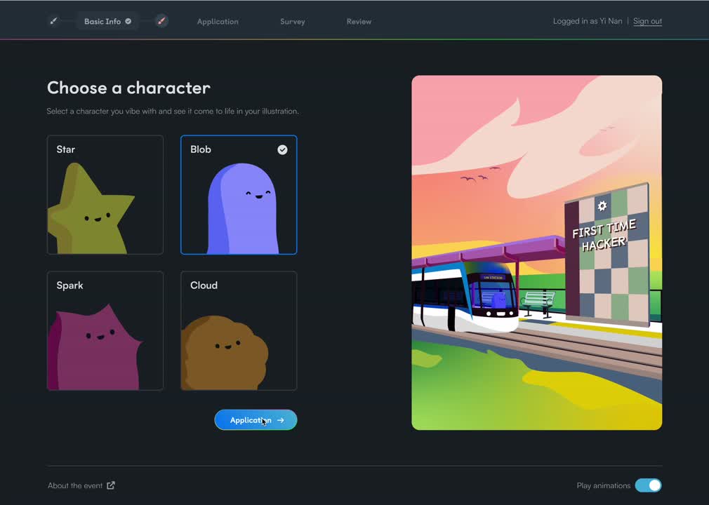
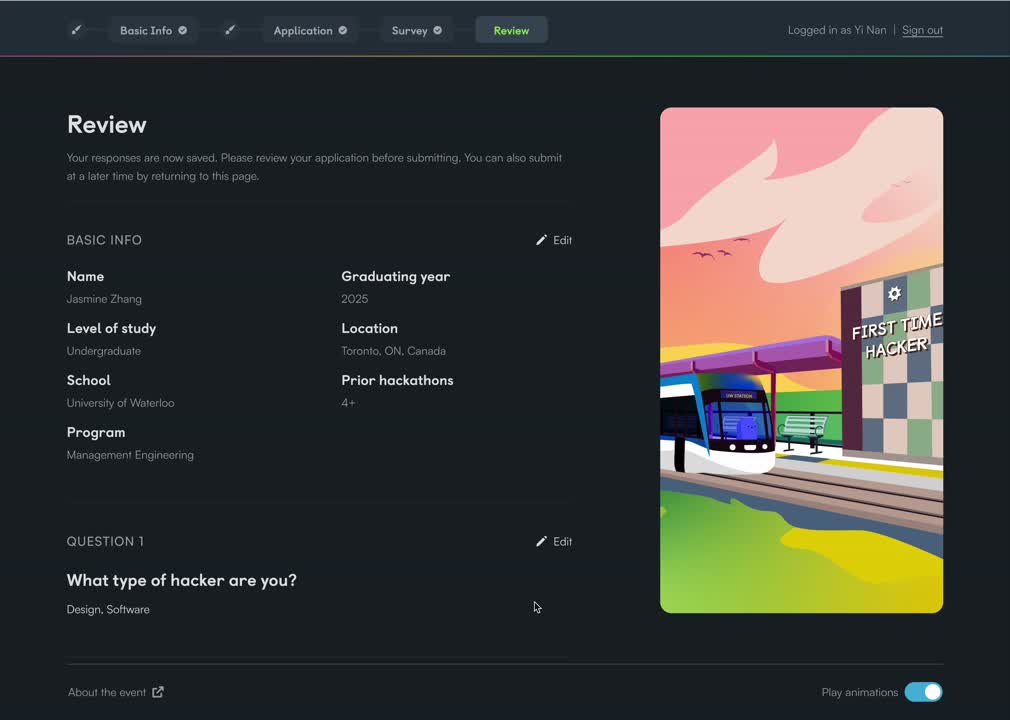
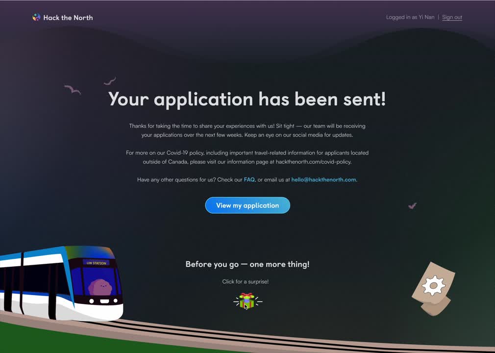
“The hacker experience begins right when they apply. That’s why we go out of our way to make it memorable—setting the tone for a once-in-a-lifetime in-person event.”

Our Vision: Fun, Personal, and Purposeful

From the very beginning, we wanted the application to feel more than just a form. Our vision was it should be an immersive experience that reflects our values, builds anticipation, and gets hackers excited for their journey to Waterloo.

In our team-wide brainstorming sessions, a few themes stood out:
“Build your
own journey”
A story-like application that mirrors a hacker’s real journey to campus
In-person
connection
Illustrations of Waterloo landmarks like E7, where the event is hosted
Magic and
movement
Inspired by our “sparks and paint” brand language, we envisioned visuals that feel alive and evolving
Shareable
digital tokens
A personalized graphic hackers could share after applying
2/8 Teamwide Breakout Room Sessions on Figjam

Our Goals

To Be Memorable
Continue to be unique and push the boundaries for an application form. We want to represent a concept that is joyful, fun, and introduces hackers to the quality that is expected of Hack the North
To Be Intuitive
While we want the application to be a unique experience, we also need to make sure the process is intuitive for all users going through the questions

Concept Development
& Visual Design

After gathering insights on how previous years tackled Hacker Apps, I learned that Hacker Apps branding should be a secondary brand that reuses elements from date launch (2022 Branding) but differentiates in some capacity. After brainstorming, Yinan and I landed on a concept with 4 themed stages—morning, afternoon, evening, and night that focused on an in-person journey. We started to explore different colour palettes and inspiration while I began drafting two central ideas before narrowing it down to one final concept.
Referencing date launch branding + pulling inspiration from theme stages/concept direction

Understanding User Flow

Hacker Apps have followed a pretty consistent structure over the years by asking hackers a mix of short and long answer questions to get to know them and understand why they want to attend Hack the North. We’re also known for having one of the most engaging and personalized application portals in the hackathon space.

To help make sense of the flow and how the illustrations tie into the experience, I’ve broken down where visuals were needed and how each step maps to the themed journey stages I designed.

Concept Exploration

I explored two concepts built around the idea that the main illustration would start with a background outline, and as hackers progressed through the application, more elements would appear to visually reflect their journey. Since the goal was to highlight the excitement of being back in person, I wanted the scenes to feel grounded in the real Hack the North experience and the Waterloo community.

For the theme locations, I chose iconic and meaningful spots that a hacker might actually encounter:
  • Engineering 7 Building – Our annual venue, right on the University of Waterloo campus
  • Ion Light Rail Transit (LRT) – A symbol of motion and connection, with its own stop behind E7
  • Rock Garden – A quiet, scenic spot in the middle of campus with the QNC building in the back
  • Waterloo Park / Silver Lake – A peaceful green space just a 10-minute walk away
These locations helped anchor the illustrations in reality while still allowing for a bit of magic and personalization.
After gathering feedback from the team and deliberation I decided to proceed with idea 2.


Heres why:

Better narrative flow: Watching the illustration build as you answer questions reinforces the idea of storytelling progress and mirrors the hacker’s journey to the event

More engaging interaction: The gradual reveal adds anticipation and makes each step feel rewarding, rather than static. Idea 2 feels more personal rather than generated like idea 1

Stronger emotional connection: Seeing the scene “come to life” makes the experience feel more magical and immersive—aligning with our goal of building hype around returning in person.
Idea 1: Personalized Scene Reveal
Idea 2: Progressive Scene Building
Idea 1: Personalized Scene Reveal
Same between ideas:
  • 4 visual variations based on time of day
    (morning → night)
  • All versions share the same background layout

    → Users start with a line-art version that fills in with colour as they toggle or progress
  • Character and expressions chosen from preset options
Differences:
  • Magical land where different elements appear in scene
  • Personalization options considered
    →Hacker’s school name embedded in signs or stone blocks
  • Character and expression choices pulled from a preset set of options
  • Optional dynamic reveal for first-time hackers only
Idea 1: Personalized Scene Reveal
Same between ideas:
  • 4 visual variations based on time of day
    (morning → night)
  • All versions share the same background layout

    → Users start with a line-art version that fills in with colour as they toggle or progress
  • Character and expressions chosen from preset options
Difference
  • With each answered question, a new scene element appears, slowly building the full illustration
  • Time of day background fills in on click, using a colour palette tied to that theme
  • Colour + element layering reflects progression through the application
  • “Returning hacker” vs "New Hacker" moments unlock special visual cues

Moodboard & Scene Reference

Once I planned out the types of scenes I wanted to create and picked the Waterloo locations to illustrate, I gathered different styles and references to have a clear vision of what I was designing.
Reflecting our branding identity I wanted to stay true to bright and vibrant colour that are full of personality
I was really drawn to this certain style since it portrayed playfullness and movement very well that made each shape very fluid
Gathering source pictures of the scenic sites to reference

Initial Illustration–Iteration 1

While Yinan (our lead product designer) was finalizing the updated application flow, I used the structure from the previous year as a foundation and layered in the new personalization ideas we had brainstormed. My early designs still revolved around the four themed stages, where elements would appear progressively with each step. During this phase, using Adobe Illustrator, I focused on exploring layout, angles, colour palettes, and how each scene would evolve while staying true to the look and feel of the real Waterloo locations we wanted to highlight.

Final Design

After several rounds of feedback and iteration, I refined the illustrations through close collaboration with the team with adjusting colours, angles, and layout to create a more cohesive and polished visual experience.

What made the final design differ from other iterations was:
  • I simplified some steps and scaled back personalization features to prioritize technical feasibility
  • One key change was fixing the Ion/University of Waterloo station perspective to match the rest of the scenes
  • Reworked the colour palette, toning down oversaturated hues and introducing better balance and harmony across all four stages
  • Shadows, lighting, and progression details were carefully adjusted to bring consistency and clarity across the illustrations and our sketchy theme from main branding was included

Lets Apply!

The Hacker Application Portal is branded and personalized from start to submit, capturing the magical hype leading up to Hack the North 2022.

Tablet & Mobile Adaptation

There were early concerns about how the illustrations would translate across devices—especially on narrower screens where visuals could get “squished” or misaligned. To prevent this, I designed all scenes with safe zones in mind, keeping key elements centred and avoiding important visuals near the edges.

Each illustration had to resize and reposition dynamically depending on the screen size.
Tablet
Mobile
Desktop: Long Answer Question

Outcome & Impact

Woohoo! The Hacker Application Portal officially launched and within just two weeks, applications started rolling in. It was exciting to see all the hard work come to life and successfully engage thousands of hackers.

Here are some of the key highlights from the launch:
36k+ Total Views

17k+ Visitors

4 mins average
time on site
4.7k+ Total Applications Submitted
6.5k+ Applications Started
Reached 94 Countries
Top Countries:
1. Canada (9.7k)
2. USA (2.1k)
3. India (935)
4. Algeria (109)
5. United Kingdom (85)
What Went Well
Made applicants excited and curious, the in-person theme worked well to get people familiar with coming to Waterloo

Internal excitement from the design team and sub-teams for pushing the boundaries of what an application could be
What I Learned
Creating the Hacker Application experience helped me grow as a designer by balancing creative vision with product constraints

Push the envelope—but know where to pull back to ship on time

Always tie visual delight back to purpose: building excitement, welcoming users, or reflecting values

Work closely with engineers early to scope feasibility and avoid burnout
Hacker Reaction
“This is my first time applying to Hack the North, but looking through the websites for the past few years they look absolutely amazing, kudos to the team! Love the themes!”
– Hacker submission

Additional excited reactions from hackers, including messages asking if the scenes were based on real Waterloo locations

Turning Brand Into Buzz

After shaping the brand and while designing a memorable application experience, our next focus was bringing Hack the North to life on social media. As one of our most important communication channels, social media plays a key role in building hype, educating hackers, and driving applications, especially for a generation that lives on Instagram and gets its news through various social platforms.

Hack the North’s Instagram has built a reputation for its thoughtfully designed, connected grid and engaging illustrations. In fact, it was one of the reasons I was inspired to apply as an organizer in the first place — so I just knew how important it was to get this part right.
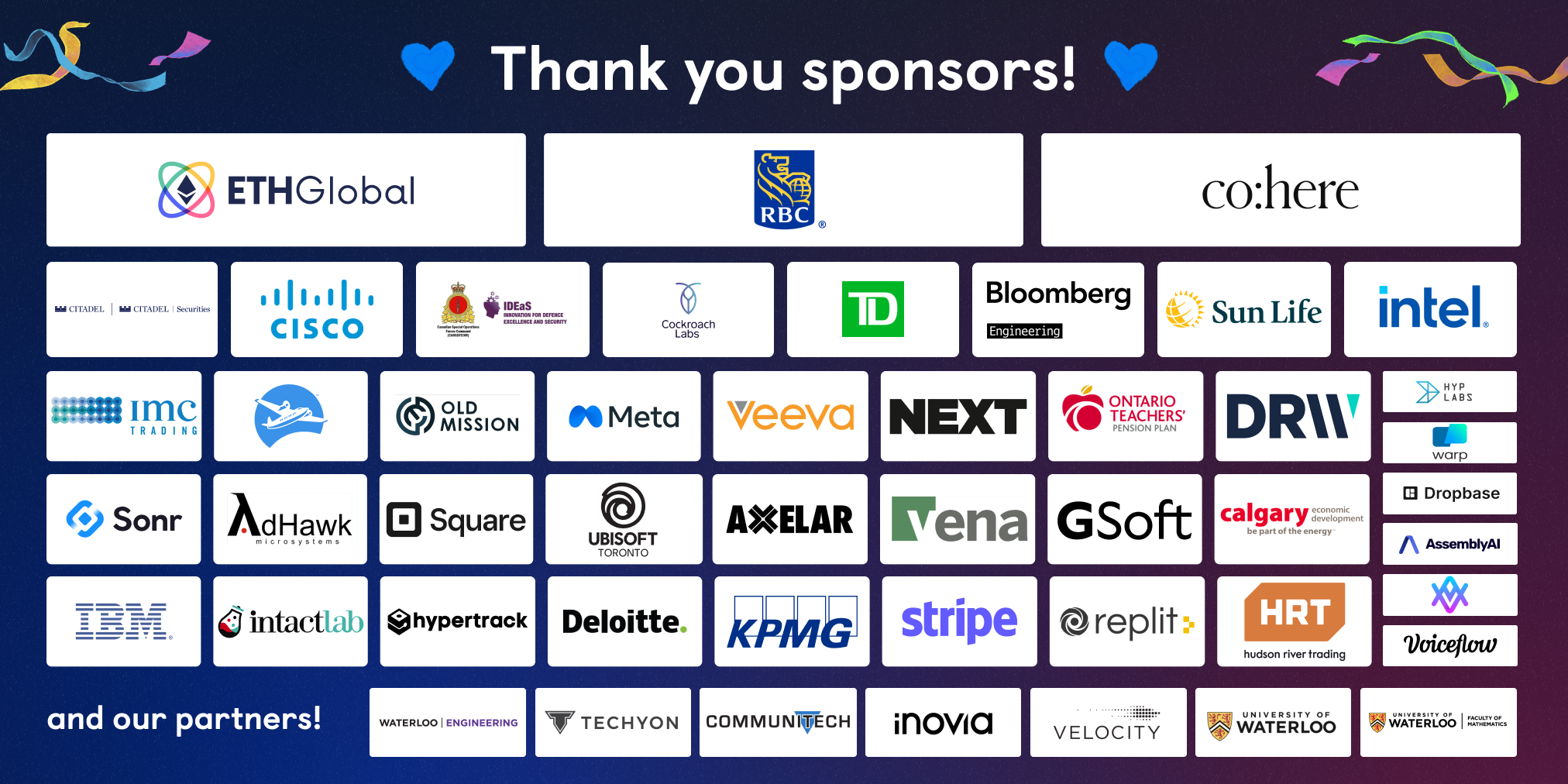
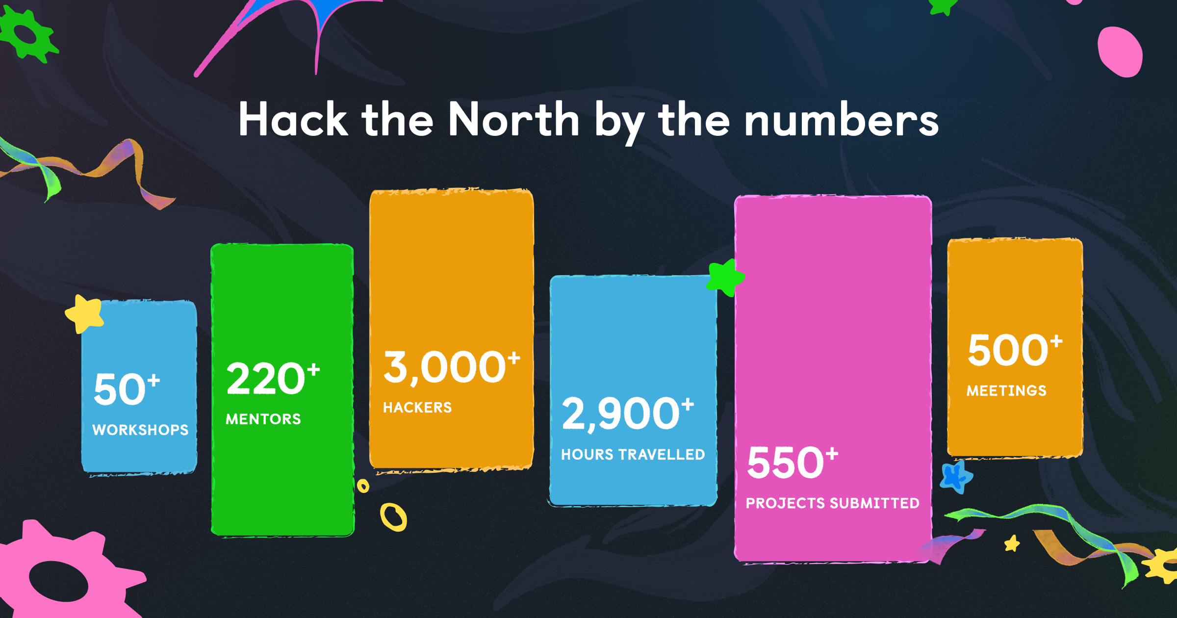
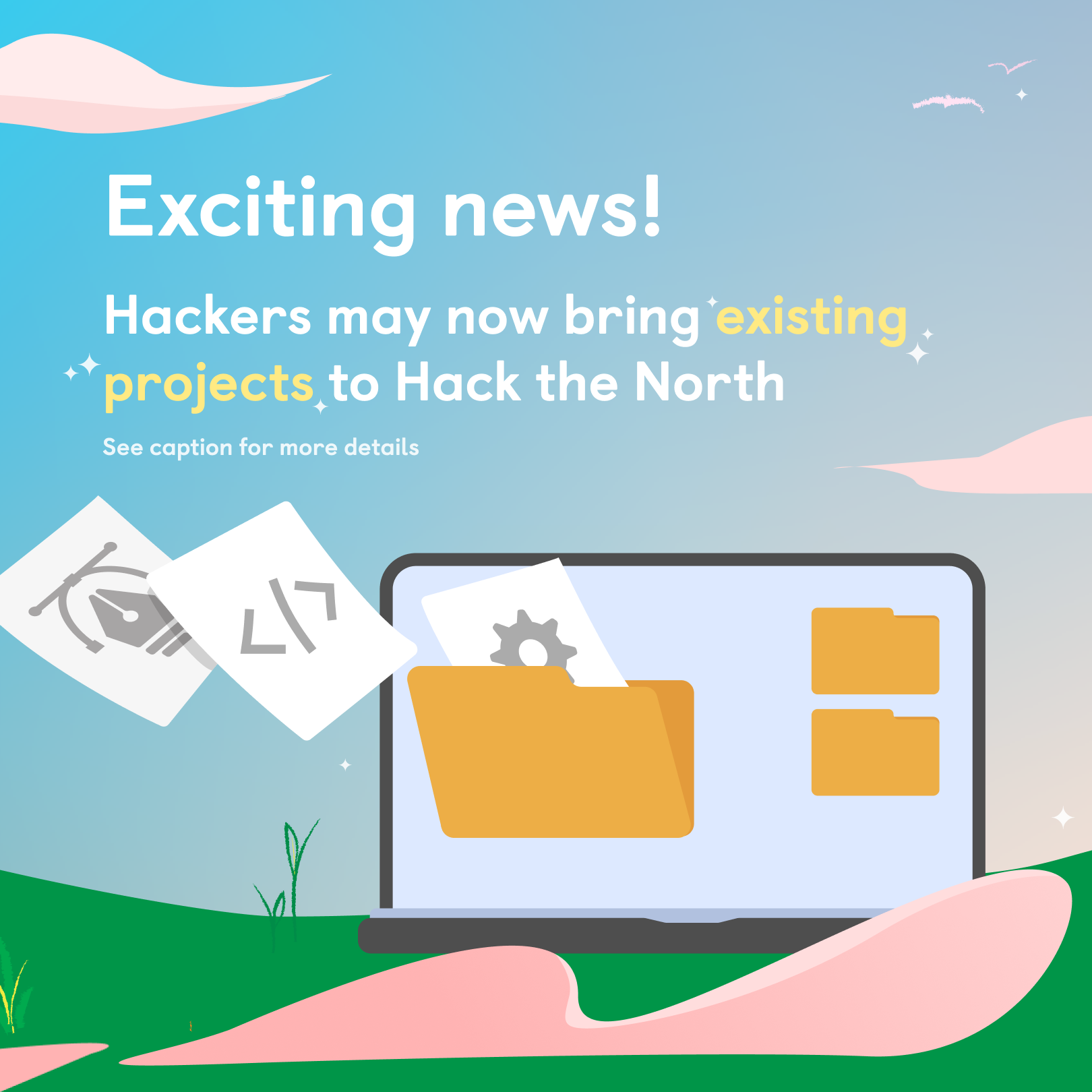
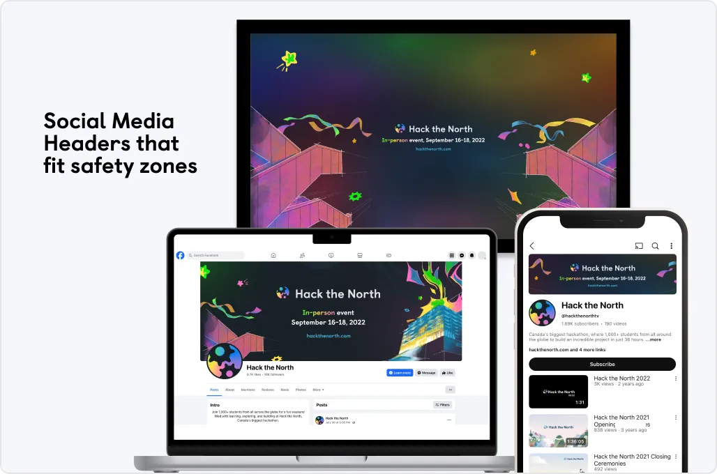
“Social media is where hackers first encounter the Hack the North brand, and it’s where we show—not just tell—what makes the event so exciting.”

Key Campaigns & Creative Strategy

A Visual Identity That Translates to Scroll

Together with Wilbur (graphic designer) and the marketing team, I worked on multiple campaign rollouts. Our goal was to ensure everything on our feed reflected the year’s visual language, while also feeling fresh and engaging in a fast-paced digital space.

While the social visuals were a separate brand system from the core website and app designs, we reused foundational motifs like sparks, vibrant gradients, and clean layouts to maintain cohesion. I prepped assets, iterated based on feedback, and ensured posts were on-brand, accessible, and visually scannable across devices.

Two standout campaigns I worked on included:

1. Date Launch–Setting our Social Presence

Announcing that Hack the North was back, when it would happen, and what to expect, was a key moment for our team. Since this campaign served as the first introduction to Hack the North 2022, it was crucial to carefully consider how we represented the event across all platforms. I was responsible for revamping multiple assets, including social media headers, banners, ads, and ensuring each asset was correctly sized and optimized for various platforms.

2. Hacker Application Launch–Kicking off Welcoming Hackers

Tied closely to the portal design, each asset was created to build anticipation and highlight what makes our application unique and why you belong at Hack the North. Every year, when Hacker Apps launches, the social media visuals shift into a secondary brand system, giving the campaign its own distinct identity before gradually transitioning back to the main branding once applications close.

To make this transition seamless, I planned and designed the gradient background system from the very beginning, continuously refining and adjusting the layouts to ensure the Instagram grid remained cohesive and connected throughout the entire campaign.

Outcome & Impact

Key Metrics (Hacker Apps)
4K followers milestone hit during campaign
16K+ accounts reached in 6 days
1,739 non-followers reached by the application post
All engagement was organic (no boosting)
What Worked
Date Launch post was the #1 engagement post in the last two years
Application launch post became our 2nd most engaged-with post in 2 years, completely organically
Campaigns were well-organized and met all major content goals
Consistent visuals helped build trust and recognition across platforms
What I Learned
We relied on templates/reused assets too heavily—some designs could’ve been more innovative or tailored
Needed more regular check-ins to ensure all assets aligned closely with evolving brand direction
Balancing speed and creativity was a challenge, especially when output volume was high
Designing for Hack the North taught me far more than how to build beautiful visuals—it showed me how to design within complex systems, collaborate across teams, and make work that resonates at scale.

Collaboration at Scale

Working across disciplines taught me how to balance clarity, creativity, and execution under real constraints. Throughout the organizing term, I collaborated closely with multiple teams:

What I Learned

How to adapt a brand system consistently across web, social, applications, and physical events/signs
That even small visual choices like the placement or style of an element can significantly impact the user experience
The value of early and frequent communication with developers to scope feasibility and reduce rework
That motion design is a process of iteration, storytelling, and a lot of patience that involves trial and error
Even though final branding may feel polished, it always takes time upfront to align on a clear message, direction, and tone
Some features had to be deprioritized due to technical constraints, which challenged us to focus on what was essential

Reflection

This experience deepened my passion for designing systems, not just surfaces. It challenged me to push creative boundaries while staying grounded in function and feasibility. Whether I was animating a landing page, shaping a hacker’s application journey, or delivering campaign graphics under tight timelines, I learned how to design for both emotion and impact.

Most importantly, Hack the North reminded me of the magic of collaborative design—when everyone brings their ideas to the table and you’re building something bigger than yourself.
Good design isn’t just about what you make.
It’s about how it makes people feel—and what it empowers them to do.
A huge thank you to Rachel, Wilbur, Yinan, and Kelvin—your creativity, work ethic, and energy made every interface, social post, illustration, and feedback session better. From late-night brainstorms to laughter-filled meetings, your mindsets and drive to be creatively great continues to inspire me.

And to the entire Hack the North team—thank you for setting the bar and making the year one of my most fuffiling university experiences I’ve had. I’ll never forget how proud I was to help bring Hack the North 2022 to life.

Thanks for reading!
Want more?